Coloring buttercream can be difficult, especially when it comes to very dark or very bright colors, and also in trying to achieve an exact color that's needed to be reproduced for a cake design. Matching colors and recreating specific colors isn't always easy to do. This guide will help you be able to properly color buttercream and frostings, as well as how to customize and create colors and color palettes. This guide will also help you understand color theory basics, help you troubleshoot any coloring issues and give you some tips and tricks for making specific colors, or color palettes.
How do different types of buttercream adapt to color?
How well buttercream takes on color and how the color develops depends on what type of buttercream you use. American style buttercream, made with butter or shortening, tends to incorporate color the fastest and easiest. This type of buttercream is considered sugar based, so there is generally less fat in this type of buttercream compared to meringue style, or any other fat based buttercream which tend to contain far more butter or shortening. American style buttercream adapts to color easier as the water based gel color dissolves in the sugar/liquid mixture, so the color can penetrate and deepen before mixing with the fat.
Fat based buttercream takes a bit longer to develop color, and can be a more frustrating process, but it can still be done. Because gel food color is water based, so it takes more color to be able to thoroughly saturate buttercream, especially in larger batches, and with very dark or vivid colors. Fat and water repel, so it takes more time for the color to emulsify and develop into the buttercream, but it is still possible to achieve dark and vibrant colors with gel colors.
Less stable buttercream, like those made with custards, roux, whipped cream or cream cheese, tend to develop color similarly to American style buttercream, but oftentimes the texture and stability can be compromised depending on how much color is added. It is also possible that the buttercream can collapse or separate with over mixing (like a whipped cream buttercream). Avoid adding too much color to these types of buttercream as the stability decreases and the texture changes.

Buttercream also falls into two base color camps. Butter based buttercream is usually more yellow hued, while shortening buttercream is white. This can also make a slight difference in the outcome of a color, particularly if you're trying to achieve a light or pastel color. If you add a touch of leaf green to white buttercream, it will most result in a hue that is more true to the bottle green color. If you add leaf green to a yellow-hued buttercream, that leaf green color will be have a warmer undertone from the yellow.
If you need your buttercream to be a pure white, you can use a concentrated bright white gel color, or you can also add very (very) small amounts (toothpick dots) of violet gel color to the buttercream to cancel out the yellow hue and create a white buttercream. I’ll explain more on how this works in the color theory section.
Coloring Large Batches of Buttercream
When coloring buttercream, fondant, ganache, etc., it’s good to invest in gel colors that are highly concentrated and true to color. Highly concentrated color requires you to use less color, making the color less likely to be tasted, and less likely for the texture to go off, which is particularly important in moisture sensitive mediums like ganache, gum paste, and fondant. There isn’t one specific brand of gel colors that I specifically use, and I'm always experimenting with new brands and colors, but I’ll list my preferred colors below.
When I say true color or true to color, I am referring to colors that are a more accurate representation of that specific color, and not color that has lots undertones of another color, or changes hues when added to buttercream. For example, some black gel colors either have a green or purple undertone that is noticeable when mixing into buttercream and fondant. Some brown gel colors have orange undertones. It takes more time to balance out the undertones, in addition to creating the desired color.
An alternative to gel color, for fat based buttercream, is to use candy color, or oil based colors. Usually these types of colors are created to be used with chocolate, and they work fantastically with fat based buttercream, and ganache and are probably my favorite use for meringue buttercream and ganache. I prefer using these colors when I can, particularly for coloring large batches of buttercream.
Coloring methods:
With a meringue style buttercream, you can color the meringue before the butter is added. Just add the color to the meringue, mix to combine, then add the butter. For a darker color, remove a small portion of the meringue, mix in the color until the desired color is achieved (it will more than likely deflate, that’s ok). Add the butter to the uncolored meringue and mix until the buttercream has reached the proper fluffy consistency. Add the colored meringue at the very end and mix to combine. Add more color if necessary.
You can also use the microwave method for buttercream. Remove about ¼ cup of finished buttercream and place into a microwavable bowl. Add gel color until the the desired color is achieved and microwave for 5-15 seconds until the color is incorporated, deepened and slightly liquid. Add the colored mixture to the buttercream and combine.

It’s important to let the colors develop and deepen for at least a few hours, preferably overnight. Particularly with fat based buttercream, not allowing the color to rest also results in speckling, which means that the color hasn't fully emulsified into the buttercream. When mixing color into the buttercream, you want to bring it close to the desired color, then allow it to rest. Especially for very dark and bright colors. The buttercream will darken a couple shades. Alternatively, you can make a darker buttercream by starting with chocolate buttercream. Adding darker colors to an already naturally darker buttercream will help you achieve those colors a bit faster with less color.
If you're concerned about tasting the gel color, or of the possibility of staining mouths, consider using the dark color buttercream only as a thinner outer layer of your cake, rather than piling on a lot of dark buttercream on the outside.
When it comes to mixing small batches of buttercream for painting on cakes, or for buttercream details, I mix gel colors directly into the buttercream with a palette knife to help blend and mix together, while also getting rid of any air bubbles. I particularly love this method because the buttercream gets super smooth and sort of shiny like oil paint.

Color theory and why it's important
Understanding basic color theory is fundamental for any artist that works with color. Understanding how colors work together, how to balance and create tones, tints, shades etc. is important in being able to create particular colors, and complimentary color palettes.
So, just a few general color theory basics.
Hues – Hues are the pure colors in the color spectrum, and refers to the dominate color family of a specific color. It’s really the term we are referring to when we mention “color”, except it doesn’t include, white, black, gray (neutrals). Red, orange, yellow, green, blue, and purple are hues.
Tints – Tints are created when white is added to a hue. Think of these as pastels, or hues that have been lightened and desaturated.
Tones – Tones are created when adding white and black (gray) to a hue. Tones can be darker or lighter than the original. In other terms, tones are created by tinting and shading the hue. Undertones can also refer to warm (red, orange, yellow) or cool (green, blue and purple).
Shades – Shades are created by adding black to a hue, making the hue darker.
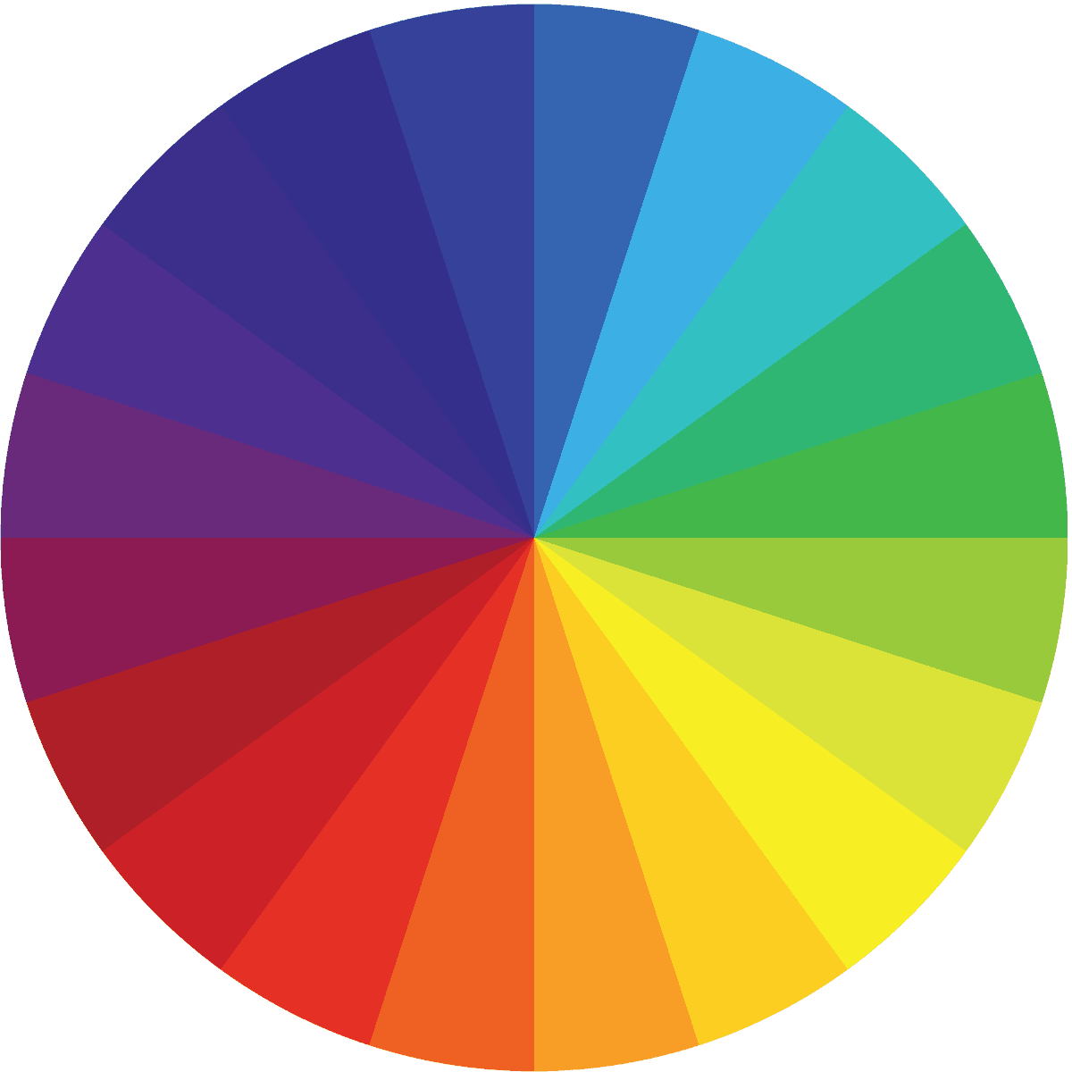
Primary colors – These are the three colors that all other hues are made from, and cannot be made by mixing any other hues together. These colors are red, yellow, and blue.
Secondary colors – These three colors are made when two primary colors are mixed together. These colors are green, orange, and purple
For the best results and the most optimized colors, build color by adding a little bit at a time with multiple colors, rather than just trusting one bottle color. Building colors, especially to create purples and pinks also reduces the chances of fading, which can happen with these colors sometimes. For example, I noticed my purple would lighten and have a blue hue. So when I make purple, I start with electric pink (or a bright pink), then I use purple. The electric pink boosts the brightness of the purple and keeps the pink tone of the purple, if the purple starts to fade.
Be familiar with what a particular gel color looks like - whether it has warm or cool undertones, or if there are any alternative color undertones. Ivory is a color I recommend to always keep on hand, Adding a little bit of ivory helps to tone down the saturation on bright colors, and can help mute a pastel. I add ivory to all my vintage colors as I like these colors to be muted and warm toned.

Hues can be neutralized when a color is too overpowering. For example, if you have a yellow hued buttercream, you can neutralize the color by adding the color opposite on the color wheel, so in this case, it would be violet. Adding a little bit of violet to yellow will "cancel" out the yellow, making it white. Another example is gray buttercream made with black gel color. The buttercream ends up looking a bit green. To neutralize the green, you would add very little red to cancel out the green since they are opposites on the color wheel, and end up with balanced gray.
Brands and Colors I like to use:
Americolor - red, black, royal blue, electric pink, electric blue, electric purple, green, bright white, lemon yellow, chocolate brown, ivory, avocado, moss, gold, dusty rose, regal purple
ProGel - purple, claret, gooseberry, navy
Artisan Accents
Wilton -brown, kelly green, ivory
Chameleon colors (oil based color)

Color mixes for popular colors:
Masala/Burgundy - more red and less purple, with a little bit of brown to tone down the brightness
Coral - more orange, less pink and a little bit of ivory to tone down the saturation
Wine - equal red and purple, a touch of brown, a touch of black
Mint - more green, a touch of blue, ivory to mute the saturation
Chocolate brown - brown, touch of black
Moss green - leaf green, touch of brown
Royal blue - electric blue, a touch of purple, a touch of black
Navy - more royal blue, less black and a touch of purple to tone the blue and make it less smoky looking
I hope I've helped answer any questions you may have regarding coloring buttercream. I'll be working on separate coloring posts for pastes, chocolate and royal that will be coming soon-ish. If you have any questions, please leave them below so I can get them answered for you!
For more on buttercream, check out these posts:
Valerie says
Ashley,
What is your suggestion to turn faux Swiss meringue buttercream a bright white color? I’ve seen articles that say whip your butter one high for 15/20 minutes & then add white Americolor & a dot of violet but when I whip my butter it makes a lot of air bubbles in my BC or turns it into a soupy texture. Even after letting it develop overnight it seems to still have a yellow tone.
Thanks,
Val
Ashley says
Hi Valerie! If the bc turns soupy right after beating in the butter, turn the mixer to medium speed and beat until it comes together into buttercream. Sometimes the mixture will break after adding butter, but it's totally normal, and you can just let it beat until it's back to buttercream consistency. The key to smooth SMBC is to beat it on low for a longer period of time after the buttercream is technically finished. 15-20 minutes on the lowest speed.
Use a true purple, like Americolor Electric purple to combat the white, with just a little bit at a time to cancel out the yellow tones.
Dee says
Hi Ashley,
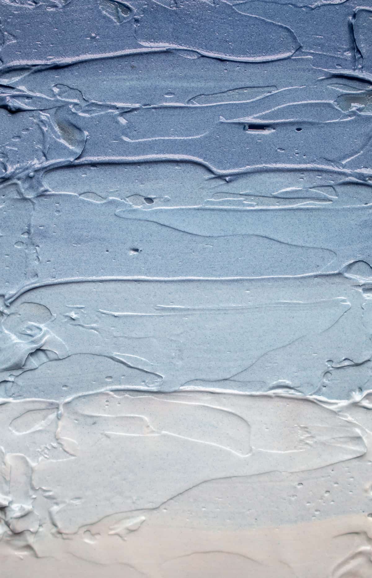
Could you please tell me what color blue you used to get those shades of blue at the beginning of this article? This is the palette of blue that I’m trying to achieve for some cookies I plant to do.
Thank you,
Dee
Ashley says
Americolor royal blue
Valerie says
I wonder if the brand of mixer being used had any effect? I find Bosch lowest speed is medium speed compared to KA.
Ada Rosa Le Riverend says
Hi
Thanks. Great article, like another reader said it will become my coluring bible. But still I would like to know how to make pastel blue with swiss meringue buttercream. I have tried adding purple, but it was a faillure. When I added the blue it became green. Another time the buttercream turned pink... Ineed pastel blue. Do you have any idea, please?
Thanks again.
Ashley says
Hi Ada! For a true pastel blue, use small amounts of Americolor Electric Blue. Americolor's "electric" colors tend to be true to color without any undertones.
Kathy says
Can you tell me how to make a sage buttercream frosting?
Ashley says
Hi Kathy! I like to use Wilton Juniper Green gel color. This a true sage color and doesn't require any additional color.
Marilyn says
Hi Ashley
Your colouring buttercream guide has become my colouring bible. Thank you so much for sharing your knowledge with us.
Can you please advise how to make indigo coloured buttercream? I use Swiss meringue buttercream.
Thank you.
Ashley says
Hi Marilyn! Indigo would be royal blue, purple and a bit of black.
Marilyn says
Thank you so much. You're a star 🌟
Cindy says
I'm wondering about a dusty blue...like a blue grey color. Do you have any suggestions? I'm mixing it for cookie icing for sugar cookies. I realize that it may be different since cookie icing is different from buttercream but any help mixing colors would be appreciated. Thank you!
Ashley says
Hi Cindy! I recommending using electric blue and a touch of black. Just keep in mind that royal/cookie icing darkens to its true color after a few hours.
Marilyn says
Brilliant article. I made red buttercream successfully for the first time following the instructions you gave. How would you make emerald green using Swiss meringue buttercream? Thank you.
Ashley says
Emerald green would be leaf green, and a little black. If it starts to look a little dull, add a little bit of yellow to brighten it up.
Marilyn says
Thank you so much for replying.
Madelyn says
This was so helpful! Question - I use Swiss meringue buttercream and I’m interested in the method of letting the buttercream rest overnight to develop the color. Do you let it rest at room temp overnight? If left at room temp, is it still structurally usable the next day - at least just for the outter layer of a cake and decorative piping? Thanks
Ashley says
Yes! Perfectly ok to use the next day at room temperature. Just give it a little mix after sitting overnight to restore the texture and you will be good to go.
Patricia says
Why is my coloured Swiss meringue buttercream patchy when covering my cake
Ashley says
It may need a bit longer to rest. The color may not be fully emulsified into the fat which can make it look splotchy or patchy when applying it onto the cake.
CeeCee says
I find that if you're chilling the crumb coat and then going in with the finishing coat of bright smbc, if you jack with it too much after it takes on the chill of the crumb coated cake, you can get streaking.
Adina Horowitz says
HI Ashley
what a wonderful article
so helpful.
how would i get a slate blue color on American buttercream
thank you
Adina
Ashley says
Hi Adina. I would use royal blue with a little bit of black.
Adina Horowitz says
I just noticed your reply, thank you
one more question regarding italian buttercream
due to dietary reasons i can only use margerine,
i tried it once and it did not work too well.
can this buttercream be make only with butter?
Adina
Ashley says
Hi Adina. I have never tried it, so I'm not sure it will work. Since margarine lacks the proper fat to emulsify into the meringue, I'm concerned it may split. If you want to try it out, halve the recipe in order to not waste ingredients. You could try a faux meringue buttercream, like the one used in this recipe: https://thelittlevintagebakingcompany.com/almond-peach-biscoff-cake-with-dulcey-faux-meringue-buttercream/ (minus the dulcey chocolate), which will give you a similar flavor as meringue buttercream. I haven't tried margarine with the recipe, but please report back if you try it out. Best, Ash.
Adina Horowitz says
Thank you very much will try and report back
Adina
Valerie says
Hi Ashley,
I loved your coloring article! Could you please tell me how to achieve a baby blue color.
I need it for royal icing & faux Swiss meringue buttercream.
Thank you!
Valerie
Ashley says
Americolor Electric Blue is a true blue color. Use a little bit at a time until you reach the desired color.
Sanjli says
How do you avoid staining hands and teeth when using gel color?
I often top cupcakes with gel dyed butter cream, but find that they almost always stain. What am I doing wrong?
Ashley says
Hi Sanji!
Staining occurs when there is too much color in the buttercream. I recommend using the most concentrated gel colors available, such as Chefmaster, Artisan Accents, or a similar brand. There's three different things I recommend trying when coloring dark or vibrant colors, and you can see what works best for you.
First, use a couple different colors (if possible) to achieve a color.
For example, for red, color the buttercream with pink gel, then use red gel. You're not using as much red which will help prevent staining.
Also, be sure to let the buttercream sit for a bit after a while after mixing, keeping in mind that colored buttercream will darken a few shades.
You can also try the melting method mentioned in my post which will help darken the buttercream faster.
I hope this helps! -Ash
Maria says
I prefer making whipped buttercream (with flour and milk paste) simply because I don't like the taste of icing sugar; however every time I make it, it looks gorgeous and fluffy UNTIL I add the colour! I use Wilton gels and very little amounts, but as soon as that goes in it looks split and grainy and completely ruined. I've searched online but can't seem to find the reason that makes sense. Any ideas?? Thank you!
Ashley says
Hi Maria!
There are a couple reasons why this may be happening. One, the water in the gel is causing the mixture to split. Seems excessive, I think, but it's possible. Remedy this by melting the food color into a tablespoon of the cooked frosting. Add back into the buttercream at room temperature.
Two, it could be temperature related. Try heating the color (by itself) to lukewarm before adding into the frosting. Alternatively, you can use chocolate (oil) based gel color.
Hope that helps! - Ash-
Innocenta Prospere says
Thank you. Very detailed and so helpful. I have saved this article for future reference since I've never been one to mix colors but would like to do so going forward.
Much appreciated. Be blessed.
Inno
Karen McEvoy says
I am going to try to replicate a mauve coloured cake for someone and wondered what food colouring you would recommend?
Ashley says
Hi Karen! For mauve, I would start with a soft pink and add very, very little black. It will make the pink have that dusty mauve look. If you need the mauve to have more of a purple tone, add a small amount of purple. Be careful to mix in the black/and/or purple a little bit at a time. Practice with a small amount of buttercream before coloring the whole batch. Hope that helps! -Ash-
Tammy Jenkins says
Was wondering how to make dusty blue buttercream. I make American buttercream for my cakes. Thanks
Ashley says
I use Americolor royal blue with a little bit of brown. Start with the blue to get the color blue you would like, then add the brown (very little at a time) until you get to the shade you want. - Ash
Jade Holloway says
This is great thanks so much for all of your tips. Jade
Valerir says
Hi!
Please tell me what color mixtures to use for a baby blue color.
Thank you very much!
Ashley says
Hi! For baby blue I use Americolor electric blue and ivory. Use small amounts of blue to achieve a light blue color, then tone it just a bit with a small amount of ivory. The ivory makes the blue not super bright but more muted, like baby blue. -Ash
Ingvild says
Hi! How would you make a gray/blue tone like the one in your top picture?
Ashley says
Royal blue with a little bit of black. I used Americolor gel colors.
Lawson says
Such a well written and detailed article for us Cakers and Bakers. Way to go Ashley🥇
Ashley says
Thank you Lawson!